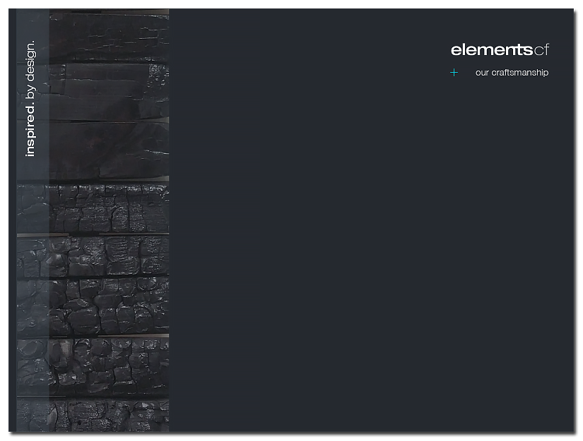
ELEMENTS CF
The philosophy of Wabi-Sabi is foundational for this business. Being in the interior furniture and finishing industry, the tactility of the brand is achieved in the contrast of sleek, heavy custom colors and earthy imagery like charred wood — reflective of the elements table graphic in the logo mark. Architecture lines and shapes also take a central role in many of the ongoing efforts to develop their overall philosophy of Wabi-Sabi.
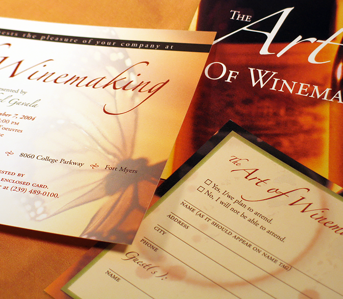
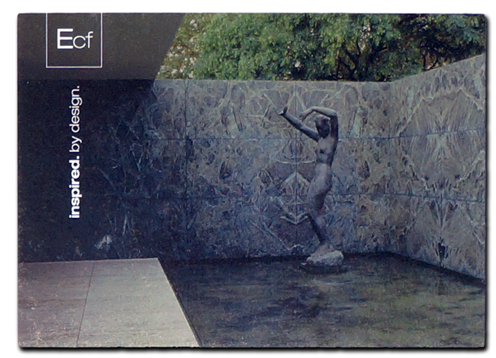
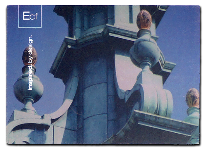
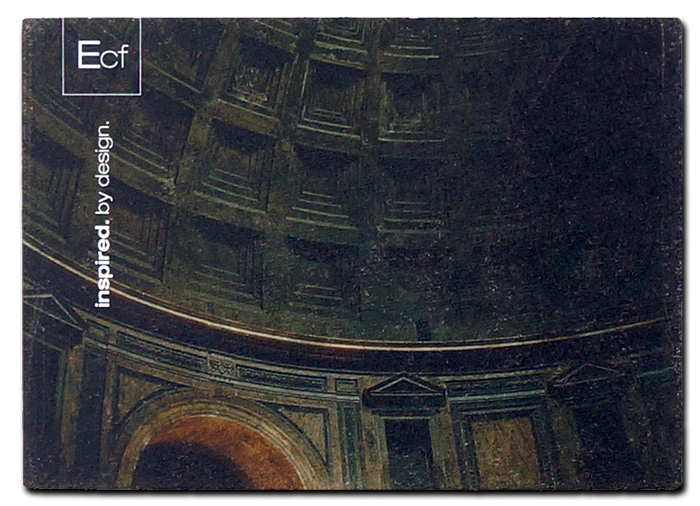
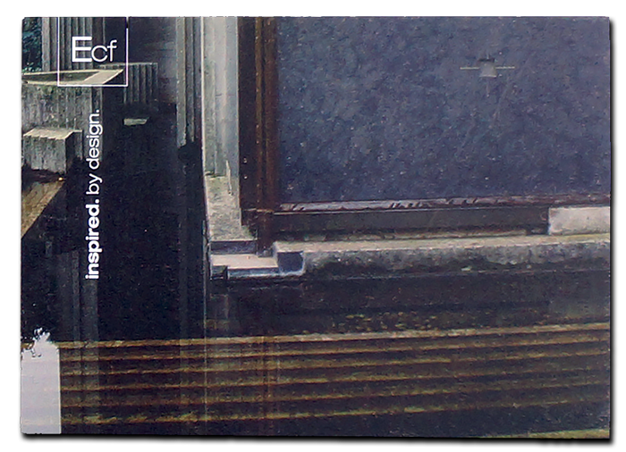
Postcard Designs
The client wanted a set of 10 postcard designs using the components of their philosophy: deep color establishing mystery, highlights shining through, and earthen, rustic representation of paper and important architecture.

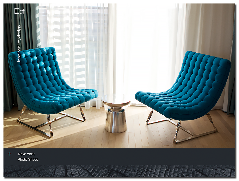
Installation Lookbook
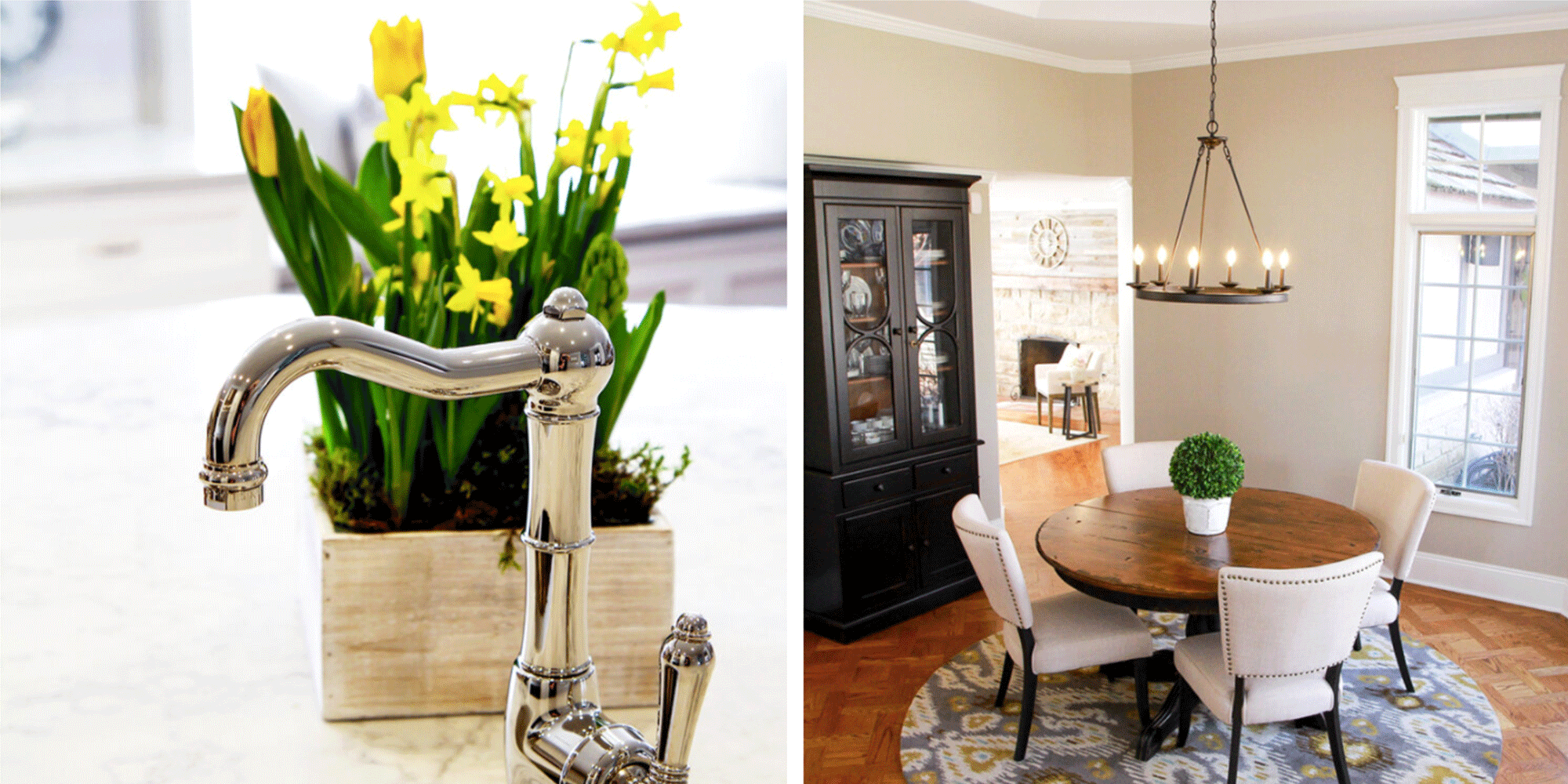
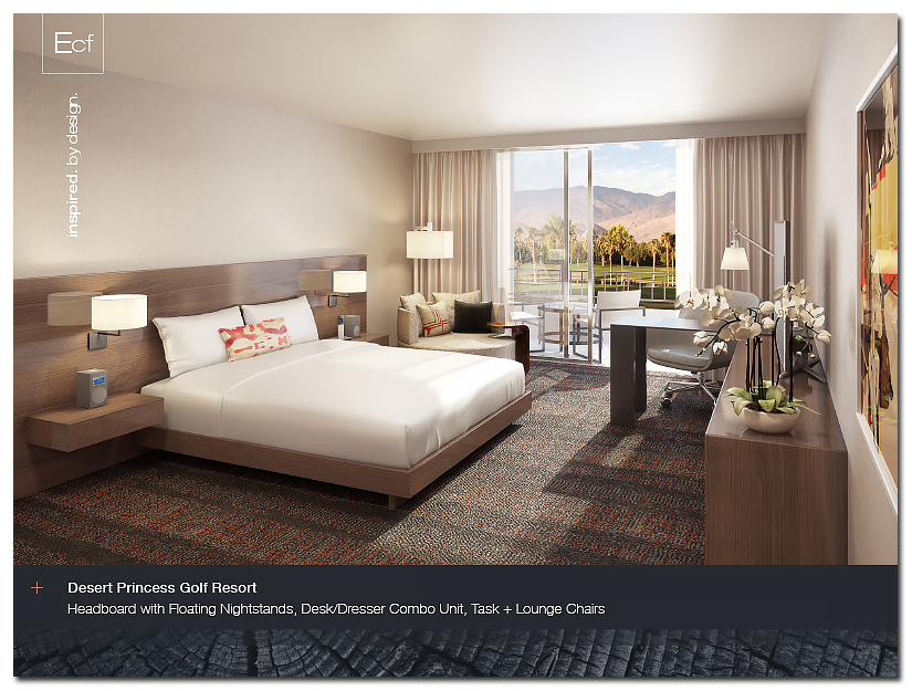
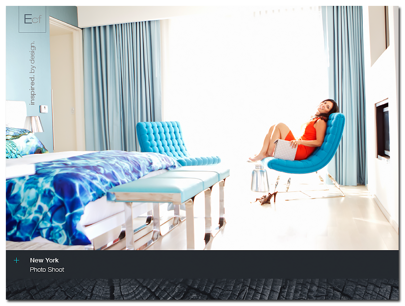
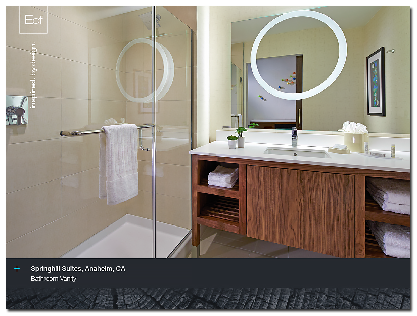
ECF had ongoing needs for various lookbooks, and this one, in particular, was used as a print version of the project installation portfolio. Keeping the contrast of simplified depth with earthy elements, the result was very well-received by clients and prospects alike.
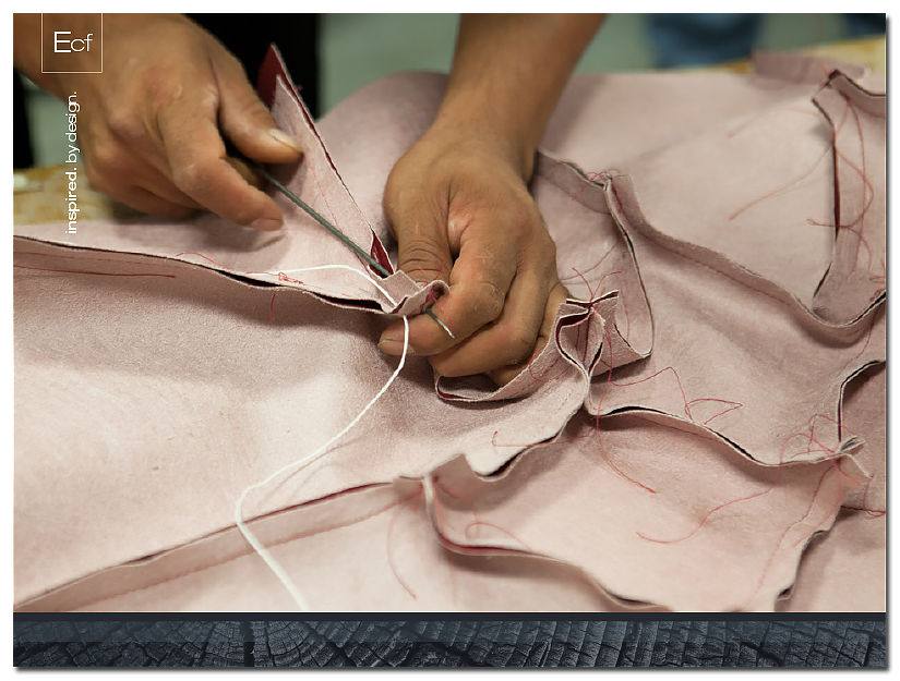
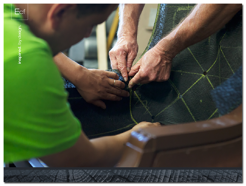
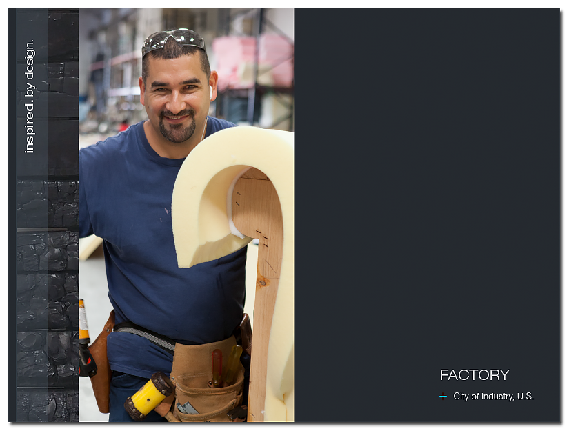
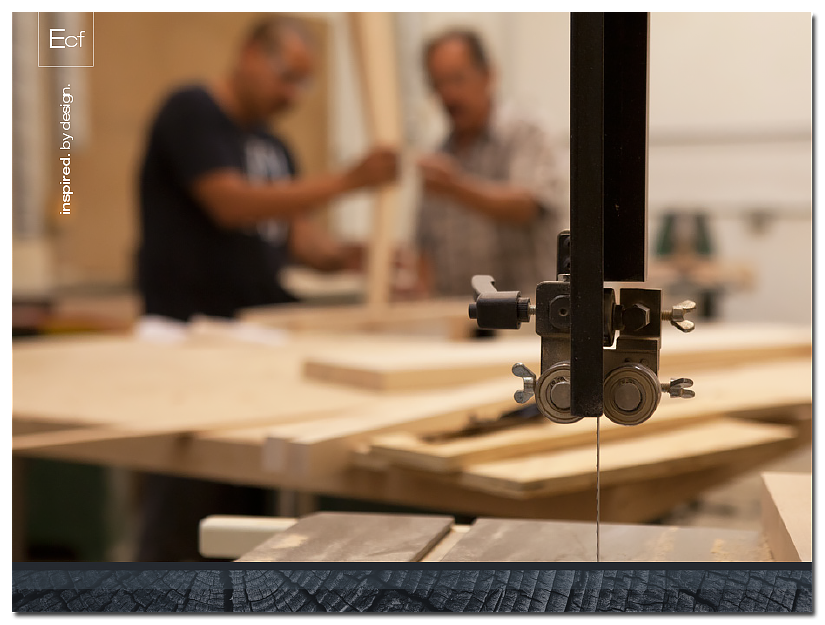
Factory Book
Similar to the Installation Lookbook, this deliverable was focused on the client’s “behind the scenes” reveal. Using beautiful close-up shots of craftsmanship, as well as engaging photography of the artisans in the production house, the viewer is drawn into the experience with more senses than just the eyes. Using a storytelling approach about the love and care that goes into all of their product lines, the booklet allows for a rich discovery about the people and products.